

At a glance
A clear mobile game makes four things easy to see: the current goal, the available action, its consequence, and the way back. Our work on BlockBloom and Humble Hustle uses those questions to guide controls, spacing, feedback and recovery.
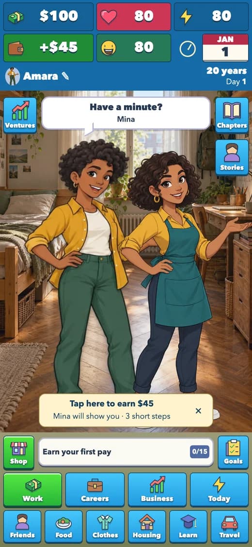
A screen can contain all the right features and still be difficult to use. The target count may sit too close to a heading. A purchase may show a price without making its recurring cost equally clear. A beautiful character scene may shrink because every new control is placed around it.
Those are design problems with practical consequences. A player can make the wrong move, misunderstand a charge or leave without knowing what to try next. Our aim is to make the next decision legible while preserving the personality of the world. The examples here describe concrete choices in our two browser games, not a claim that every accessibility issue has been solved.
Let the goal decide what receives emphasis
In BlockBloom Classic, current score and personal best belong near the board because the mode is about keeping a run going and improving the result. In collection Adventure, the remaining target icons deserve that attention. Giving the same visual weight to everything would make the modes harder to distinguish.
The equivalent in Humble Hustle is the relationship between the next chapter goal and the wider life resources. The player needs to see health, energy and happiness while making decisions, without letting those controls consume the whole character scene. A chapter list should explain what is unlocked and what is still required.
A useful review question is: if the player looked away and returned, could they tell what they were trying to accomplish? If the answer depends on remembering a paragraph that has already disappeared, the screen needs a clearer reminder.
Separate the visible piece from its touch target
BlockBloom’s tray shows clean shapes rather than enclosing each one in a visible grid. The area that accepts a grab can still be generous. This lets the artwork remain precise without asking a finger to hit a tiny painted square.
Dragging also needs a clear landing position. The piece can lift above the finger, and the final release must match the position the player intended. A select-then-place alternative gives another way to act when dragging is uncomfortable or imprecise.
W3C’s WCAG 2.2 guidance sets a 24-by-24 CSS-pixel minimum target criterion with specified exceptions, including spacing. It also notes that larger targets can be easier to use. We use that as a reference point, not as proof of whole-game compliance: a measured button size does not tell us whether every interaction works well for every player.
Keep the meaning attached to the number
In a life simulation, ‘$450’ is incomplete information. Is it a one-time purchase, a monthly bill, a wage or a per-shift benefit? Labels and spacing need to keep those meanings attached to the right amount.
Humble Hustle separates purchase costs from upkeep and shows signed changes in outcomes. A manager confirmation includes ongoing wages. This is more useful than making every positive number green and hoping the player infers the rest. Color supports the explanation; it should not carry the entire explanation.
The same principle applies to a disabled action. ‘Save $450 first’ and a visible current balance explain a next step. A dimmed button with no reason invites repeated taps and frustration. Recovery should be an understandable action, not a puzzle hidden inside the interface.
Animate the consequence, then get out of the way
A collection icon moving from a cleared cube to its target counter connects cause and result. A money change attached to an activity outcome explains what just happened. A brief character entrance helps distinguish a new visitor from an ordinary clock update.
The animation becomes less useful when it blocks the next choice or repeats on every refresh. Our entrances are bounded, and reduced-motion alternatives preserve the result without requiring the same movement. The website’s game-art reveal also runs once and leaves content visible without JavaScript.
A large clear can earn a stronger celebration than an ordinary placement. But even a strong effect needs to leave the goal, result and next action readable. The reward is the completed move; the visual should help the player understand and enjoy it.
Review difficult moments, not just the opening screen
A clean first screen is only one test case. We also need to look at a crowded board, a long purchase label, low resources, an unaffordable choice, a saved result after reload, and an account conflict. Those moments put pressure on the layout and the language.
Automated browser checks can catch overflow, missing images, broken navigation and some state regressions. Rule tests can verify that a reward is not granted twice. Neither is a substitute for people using real phones, different text sizes and their preferred input methods. We distinguish those kinds of evidence rather than calling a passing test suite proof of perfect usability.
Useful feedback names the moment: ‘The message covered the care button,’ or ‘I could not tell whether that price was monthly.’ If something in either game is unclear, that level of detail gives us a concrete problem to reproduce and improve.
Your next move
Good polish makes a choice easier to understand. Clear goals, forgiving input, labeled consequences and an obvious recovery route matter more than adding another layer of decoration.
Sources & further reading
Checked against the website betas on 30 October 2026. Game rules and prices may change during development.
- BlockBloom
First-party examples of goal presentation, placement controls and collection feedback.
- Humble Hustle
First-party examples of needs, progression, purchases and character scenes.
- W3C: Target Size (Minimum)
Accessibility reference for target dimensions and spacing; not a certification of our games.

From Rewritely Games
We make BlockBloom and Humble Hustle. These first-party guides explain the games we build, including their current limits.